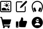
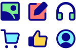
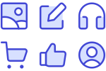
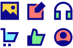
The world's largest icon family with encyclopedic coverage. Designed over twelve years, Ultimate offers every concept from common to rare icons. It's a neutral style and fits most use cases.
Filled icons use solid shapes and complete coverage to create strong, recognizable forms. With full color saturation and clear boundaries, they provide excellent contrast and visibility, making them perfect for primary actions and important interface elements.
The world's largest icon family with encyclopedic coverage. Designed over twelve years, Ultimate offers every concept from common to rare icons. It's a neutral style and fits most use cases.
The Helvetica of icons. Core is stripped to essential form with generous spacing. It's a timeless workhorse for interface design.
Flex is a fluid icon family inspired by nature’s curves. It favors smooth, flowing forms. More organic than Core and subtler than the chunky Plump. Read about the design process.
Sharp combines pure geometry and bold structure for a brutalist, high-tech feel. It’s raw, trendy, and unapologetic. It pairs best with typefaces that have strong construction, such as Futura, Gill Sans, or Space Mono.
100% cute and playful. Features subtle curves and chunky shapes inspired by animated cartoons. Recommended for friendly brands.
Cyber is one of our most challenging icon sets: no curves, only straight lines and sharp angles. Inspired by sci-fi aesthetics, it’s perfect for bold brands and futuristic tech.
Streamline Vault holds hidden gems: Guidance for signage, Platinum for luxury ecommerce, Block for Bauhaus design, Stickies for fun, Kameleon for flat color, Nasty for… well, you’ll see… and more.
Phosphor is a free and open source icon set, created by by Helena Zhang and Tobias Fried.