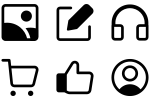
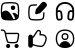
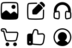
Outlined icons feature distinct borders that define shapes clearly while maintaining an open, breathable feel. The consistent outline weight creates visual harmony across icon sets, making them perfect for interfaces that need clear definition without visual heaviness.
Flex is a fluid icon family inspired by nature’s curves. It favors smooth, flowing forms. More organic than Core and subtler than the chunky Plump. Read about the design process.
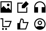
Sharp combines pure geometry and bold structure for a brutalist, high-tech feel. It’s raw, trendy, and unapologetic. It pairs best with typefaces that have strong construction, such as Futura, Gill Sans, or Space Mono.
These icons follow our Streamline’s structure and loosely adopt Google Material’s style. With no padding, they appear larger and became the predecessor to our Material Pro set.
Streamline Vault holds hidden gems: Guidance for signage, Platinum for luxury ecommerce, Block for Bauhaus design, Stickies for fun, Kameleon for flat color, Nasty for… well, you’ll see… and more.
Material Symbols by Google is a free, customizable set of 3,300+ icons in outlined, rounded, and sharp styles. Adjustable size and color make them ideal for web, app, UI/UX, and graphic design.